Research Collaborator, GCE-SCIPE at UMCES
Mapping change, from a single riverbed to an entire biodiversity hotspot.
Geospatial analyst, cartographer and developer. Visualizing spatial data as maps and web apps. Building remote sensing workflows and research tools for satellite, aerial and drone imagery.
What I do
Remote sensing pipelines
Landsat, Sentinel-2, HLS, NAIP and beyond, from download to analysis-ready products, reproducible and documented.
Web maps & dashboards
Interactive maps and dashboards for exploring and sharing data.
Maps & cartography
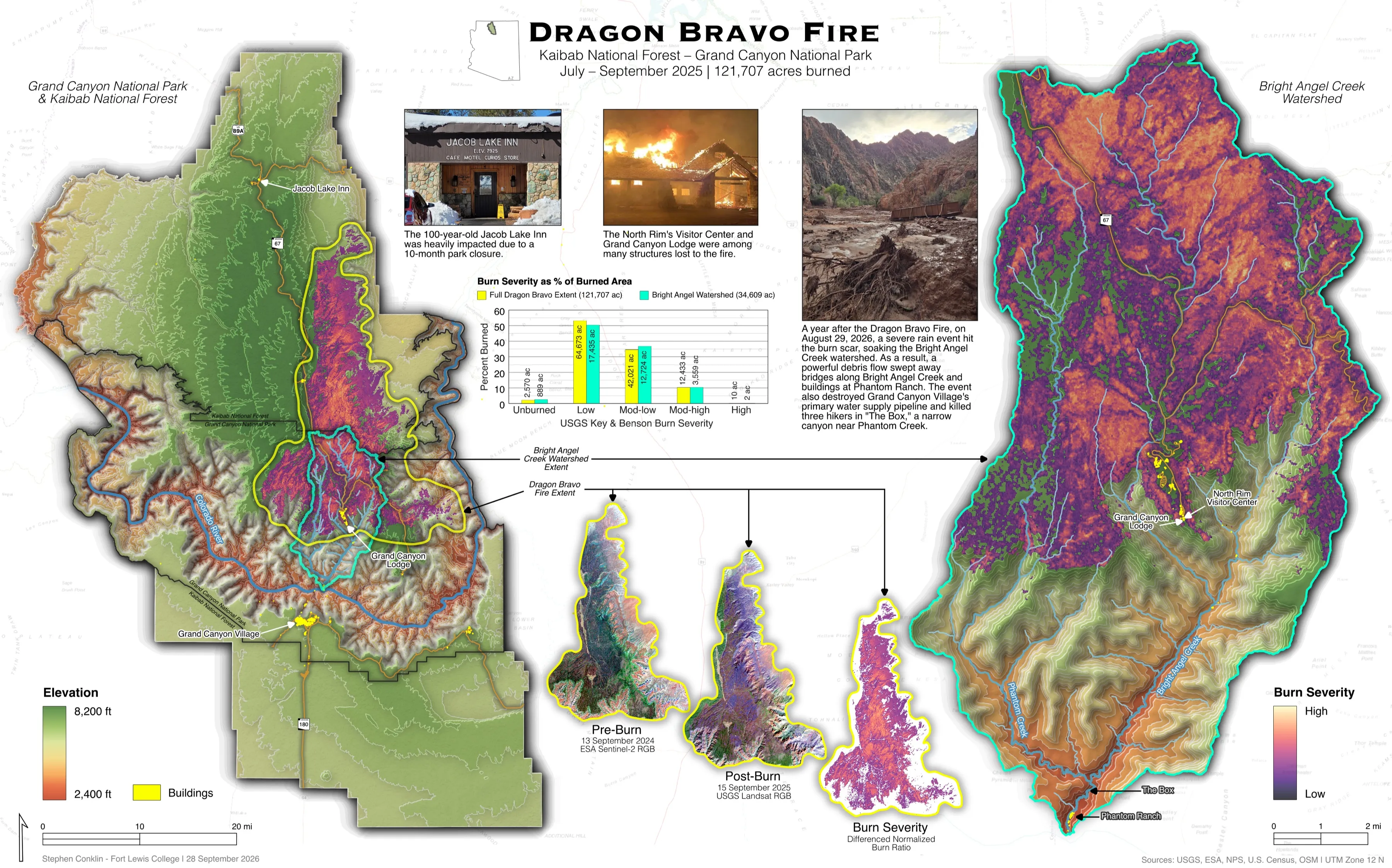
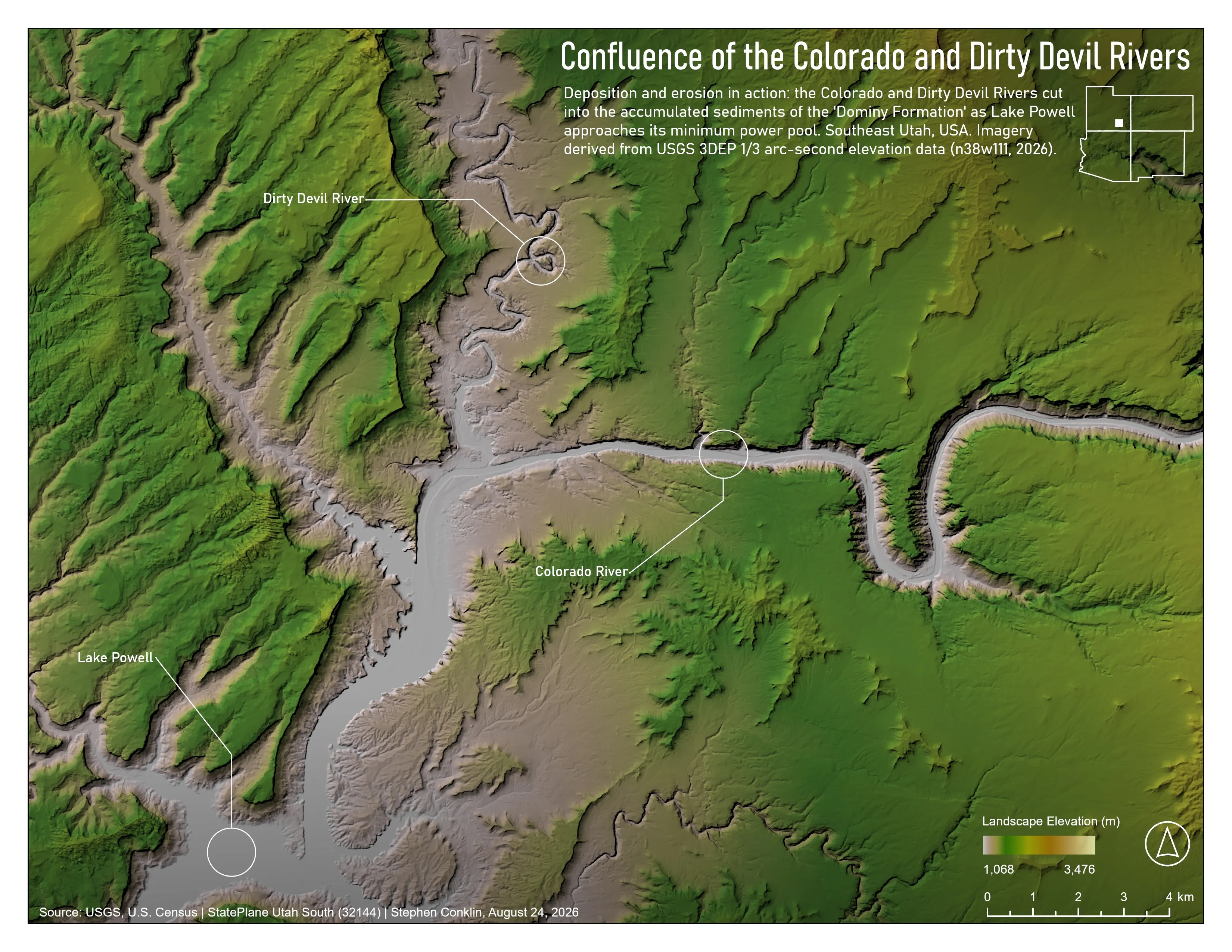
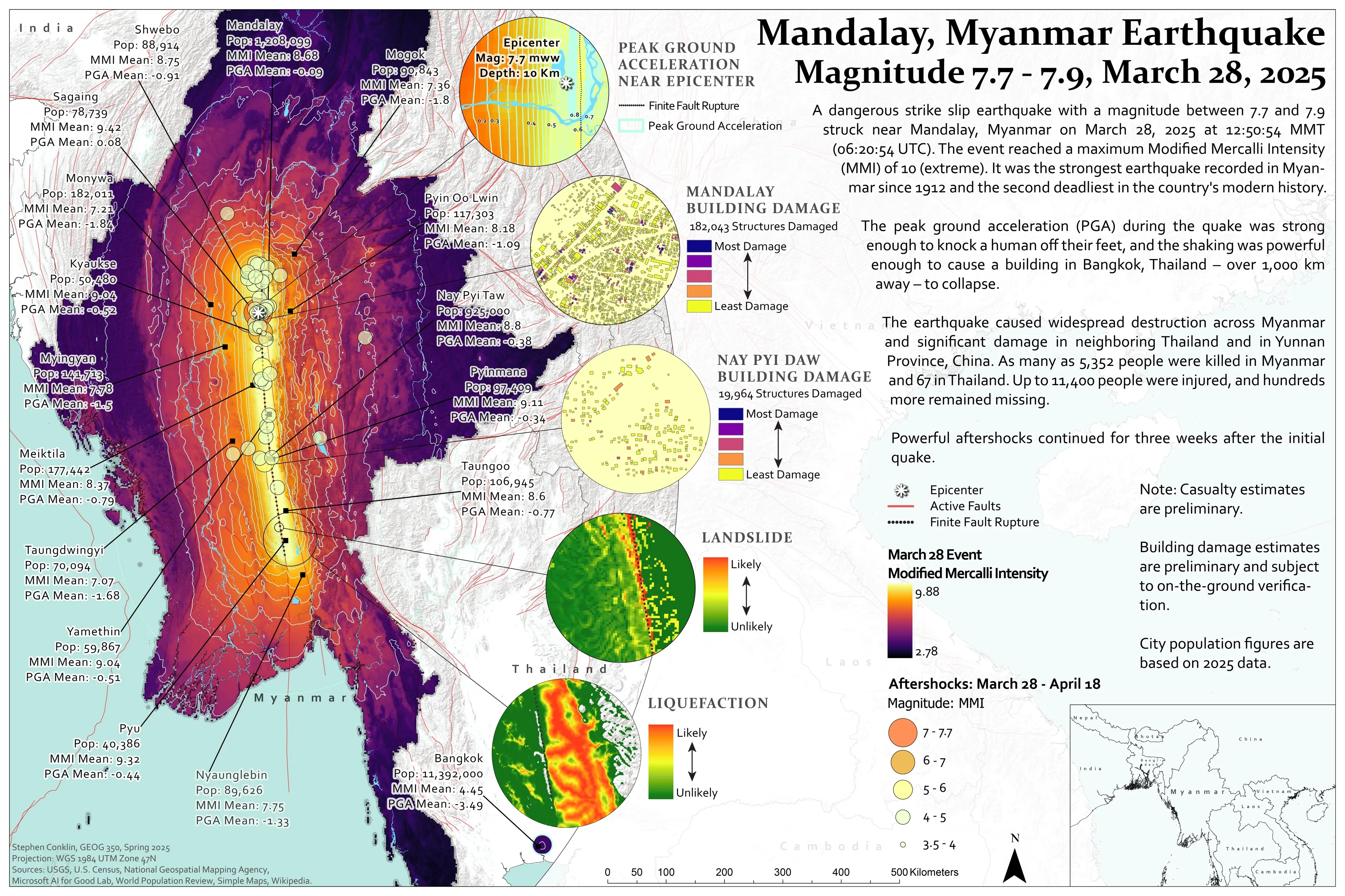
Maps for print and screen, from wildfires and earthquakes to landscapes and change.
GIS plugins & automation
QGIS plugins and processing tools that turn many manual steps into one.
Featured Research · NASA BioSCape
From satellite data to research model inputs
As a Research Collaborator with the National Science Foundation–funded GCE-SCIPE team at UMCES, working with Associate Research Scientist G. Burch Fisher, I turned a decade of NASA satellite imagery into phenology data for BioSCape, a NASA-funded US–South Africa biodiversity project in one of the world’s 36 biodiversity hotspots.
- 01
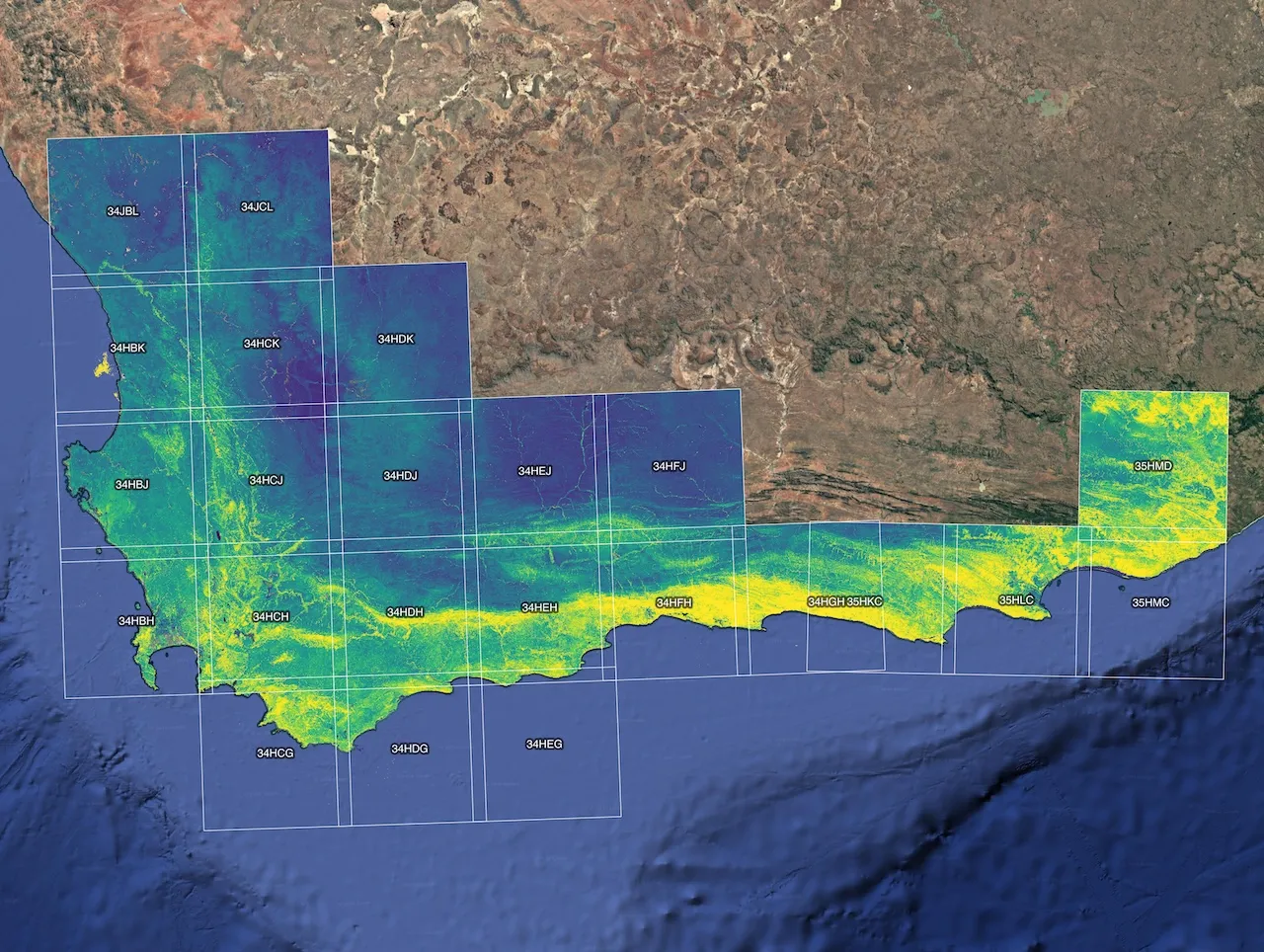
Satellites see the Cape
A decade of NASA Harmonized Landsat & Sentinel-2 imagery, every few days, at 30 m.
HLS Vegetation Index Pipeline → - 02
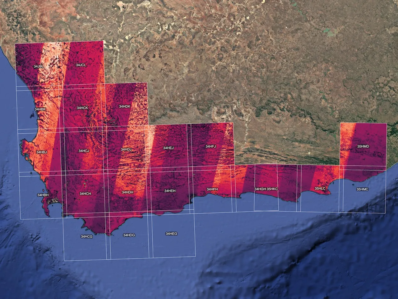
Clouds out, every look counted
My pipeline masks clouds and shadows and tracks how many clear views each pixel gets.
HLS Vegetation Index Pipeline → - 03
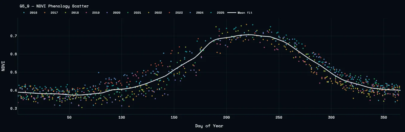
Each pixel’s seasonal rhythm
Ten years of observations become one smoothed curve: green-up, peak, senescence.
VI Phenology → - 04
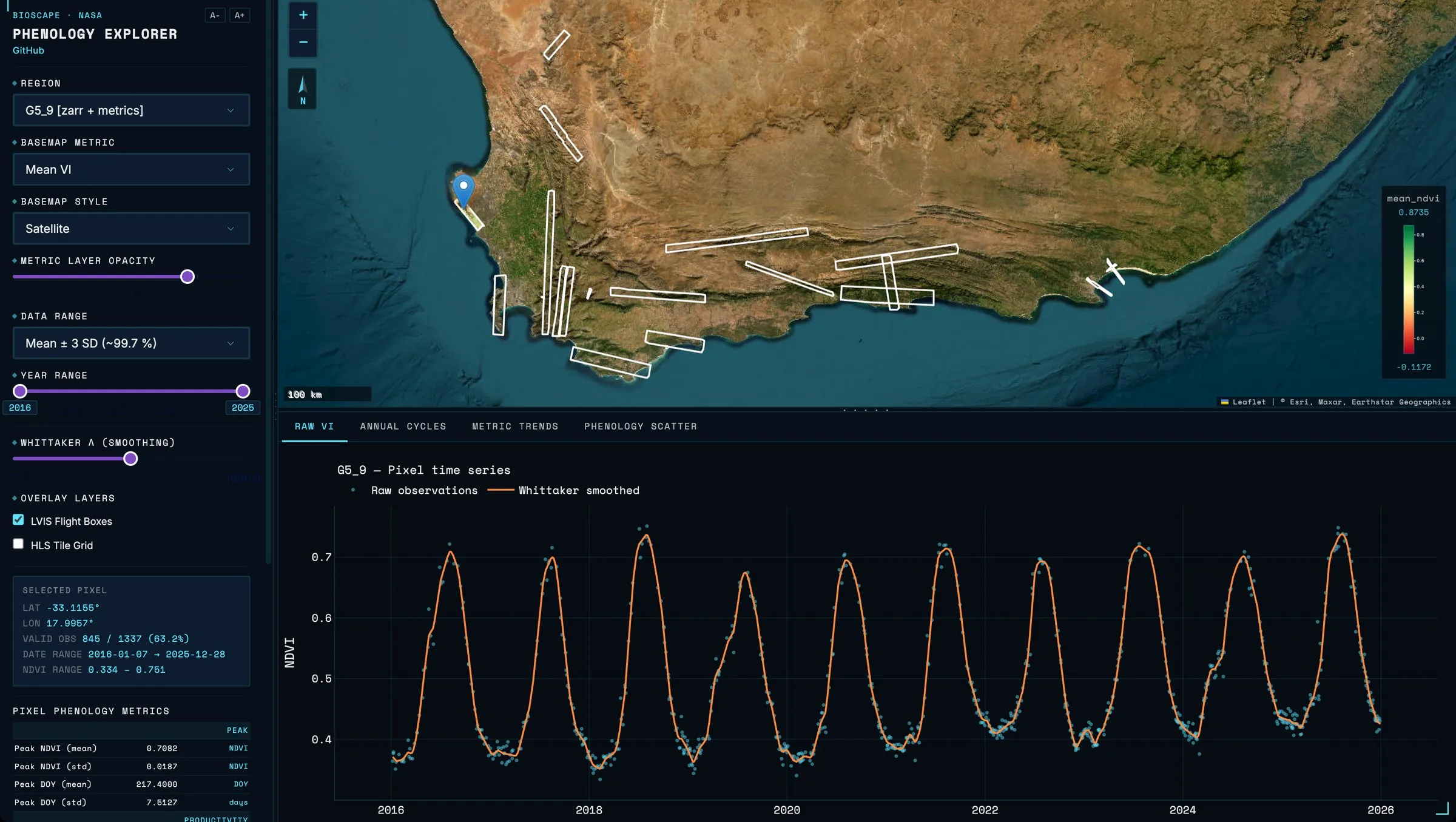
Researchers explore it
The BioSCape Phenology Explorer: pick a region, click any pixel, see its phenology.
BioSCape Phenology Explorer →
The deliverables: NetCDF datacubes of time-series phenology for every 30 m pixel, used as model inputs for the BioSCape project, and the BioSCape Phenology Explorer, a dashboard that lets scientists visually explore and navigate the project’s regions and metrics.
- NASA HLS v2.0
- Python · xarray · Dask
- CF-1.8 NetCDF
- Zarr
- Plotly Dash
- NSF Jetstream2
Select projects
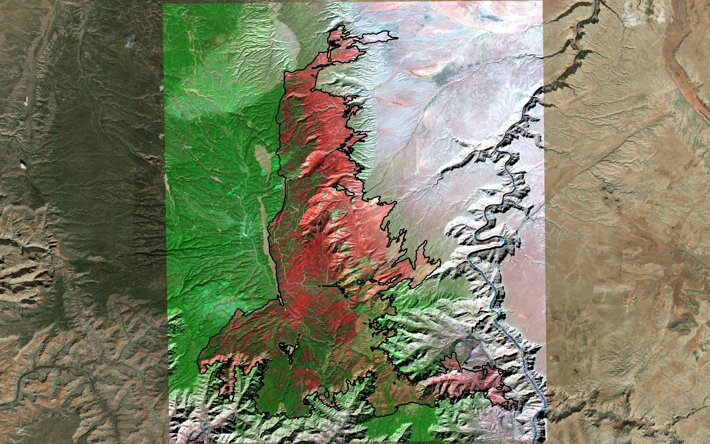 GIS plugin
Wildfire Analysis Toolkit
Fire perimeter in, burn-severity map and report out in about two minutes — validated against MTBS.
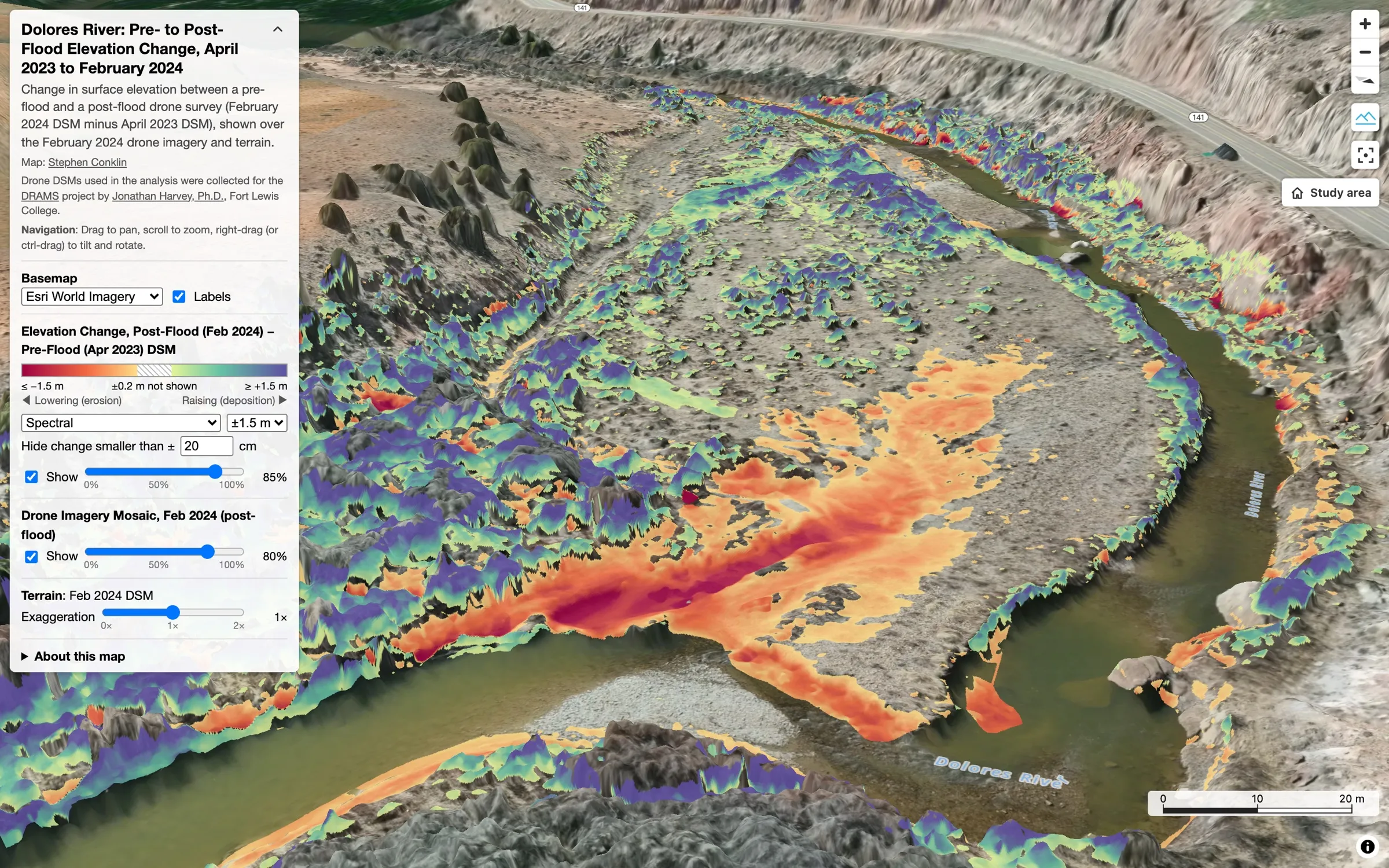 Web map
Dolores River Geomorphic Change Detection
Centimeter drone surveys of a flood, explorable in 3D in any browser.
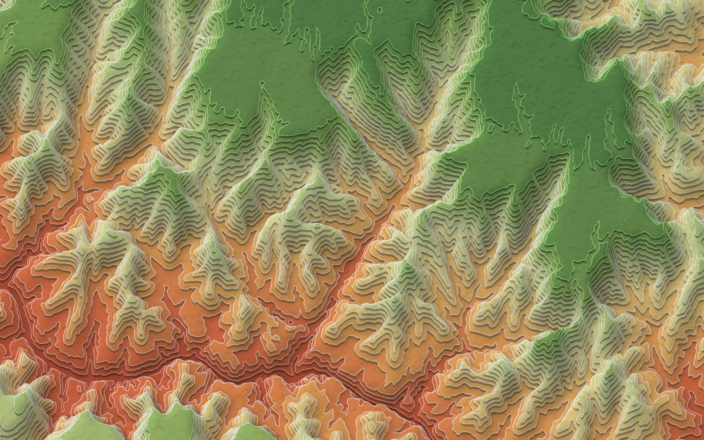 GIS plugin · Cartography
QGIS Stacked Terrain Builder
Turns any elevation model into layered, paper-cut terrain art, natively in QGIS.
Cartography
Wildfires, earthquakes and landscapes, designed to be read at a glance.
About
Based in Durango, Colorado, I’m a Research Collaborator with the National Science Foundation–funded GCE-SCIPE team at the University of Maryland Center for Environmental Science. Most recently, in collaboration with Associate Research Scientist G. Burch Fisher, I’ve built remote sensing tools and a dashboard for BioSCape, a NASA-funded biodiversity project in South Africa. Before GIS I spent over two decades building web and data systems and worked as a field technician in the San Juan Mountains.
Full background & CV →