Wildfire Analysis Toolkit
A QGIS plugin that goes from a fire perimeter and dates to calibrated satellite imagery, MTBS-style burn severity, area summaries, a map and a report.
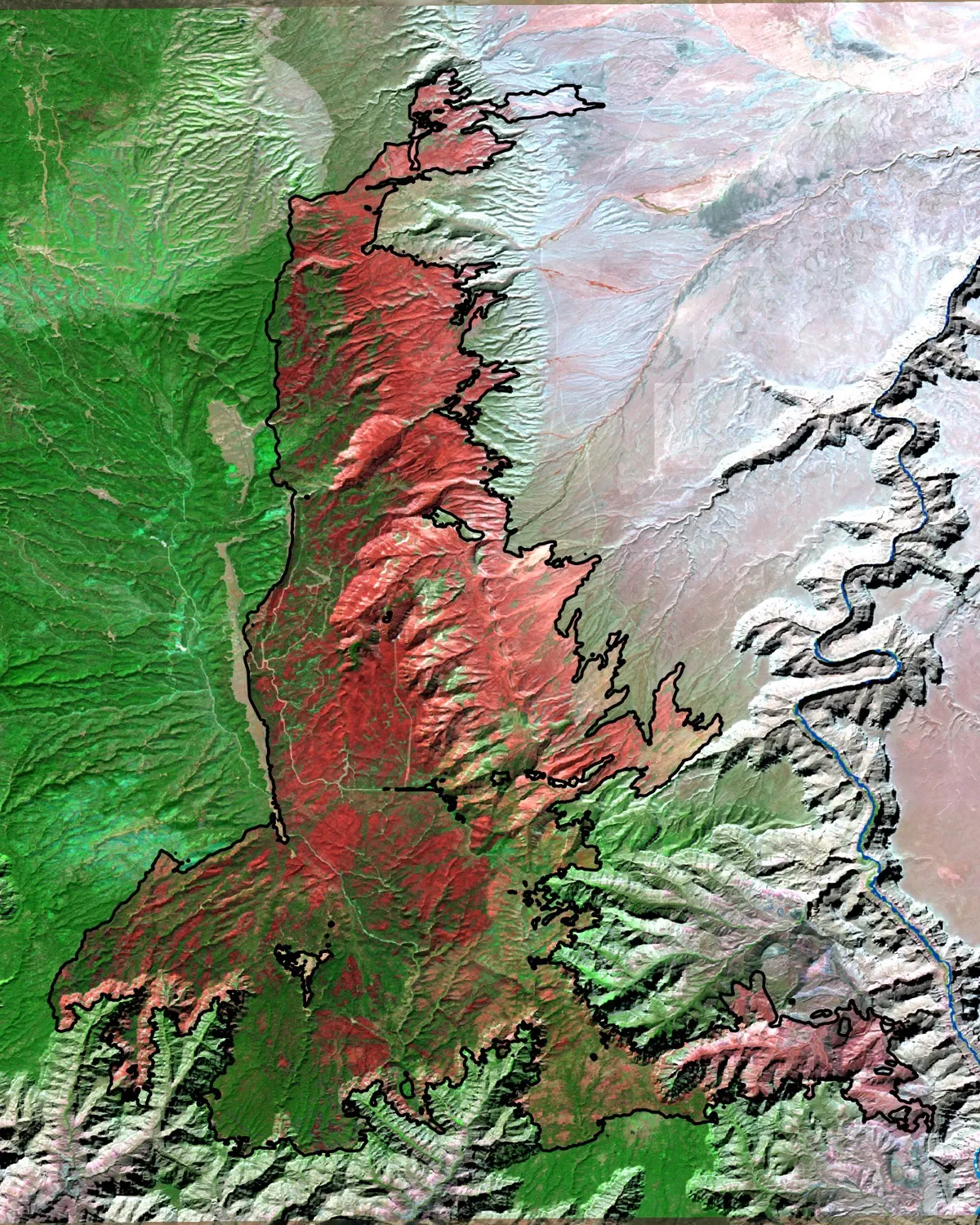
Post-fire false color (shortwave infrared, near-infrared, red), October 2025: burned ground shows red-brown, unburned forest green.
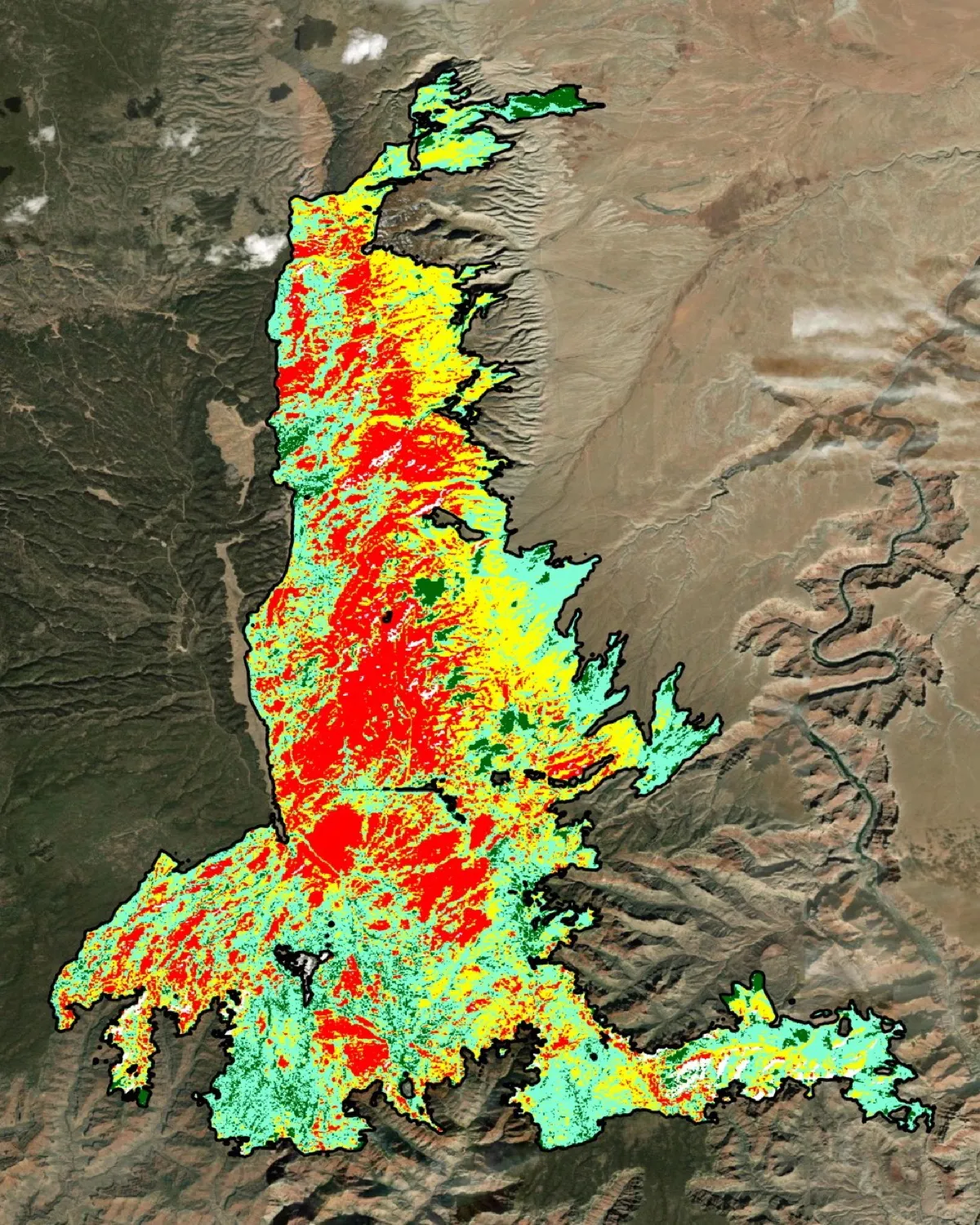
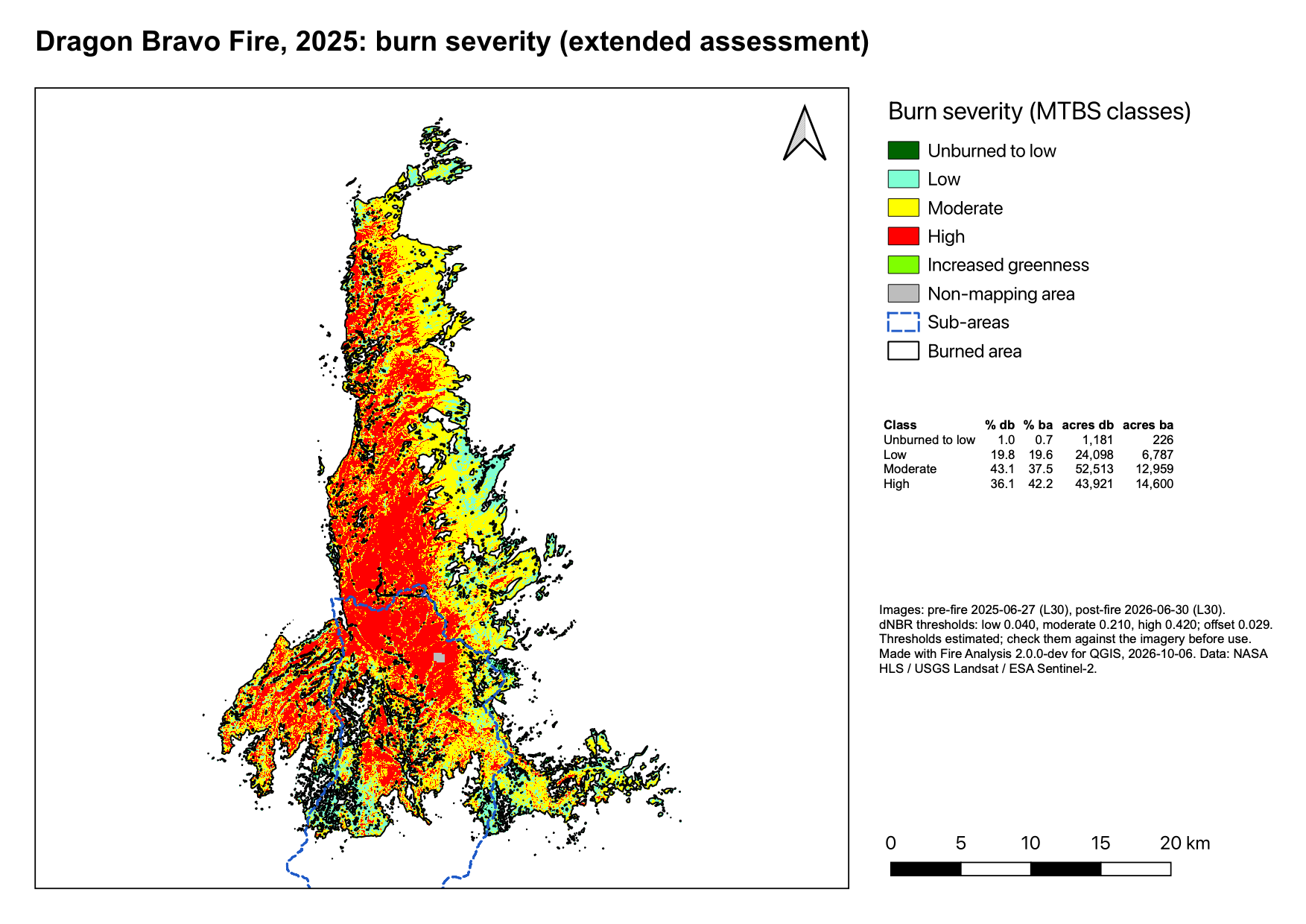
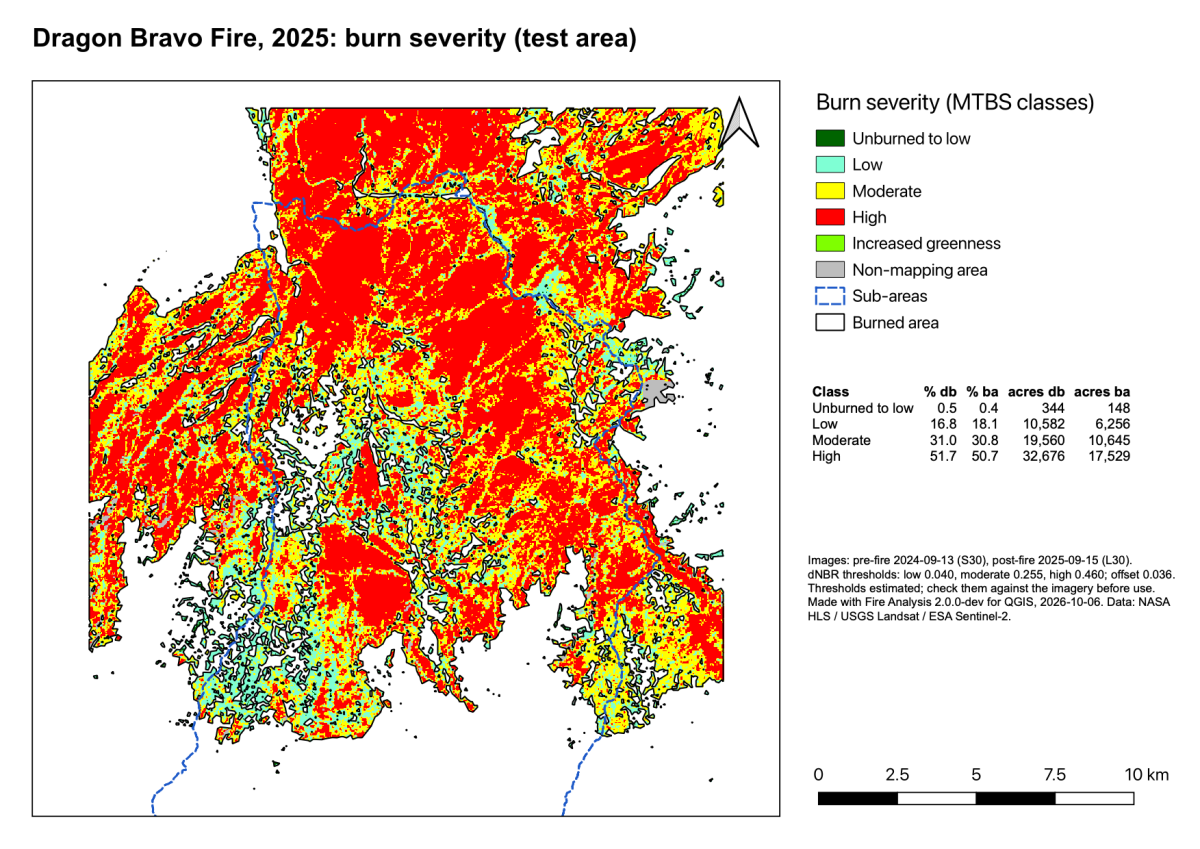
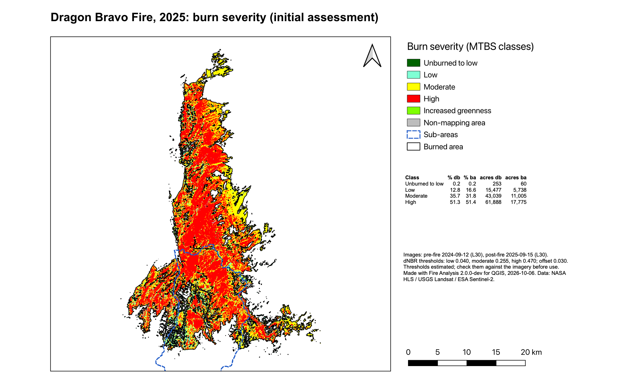
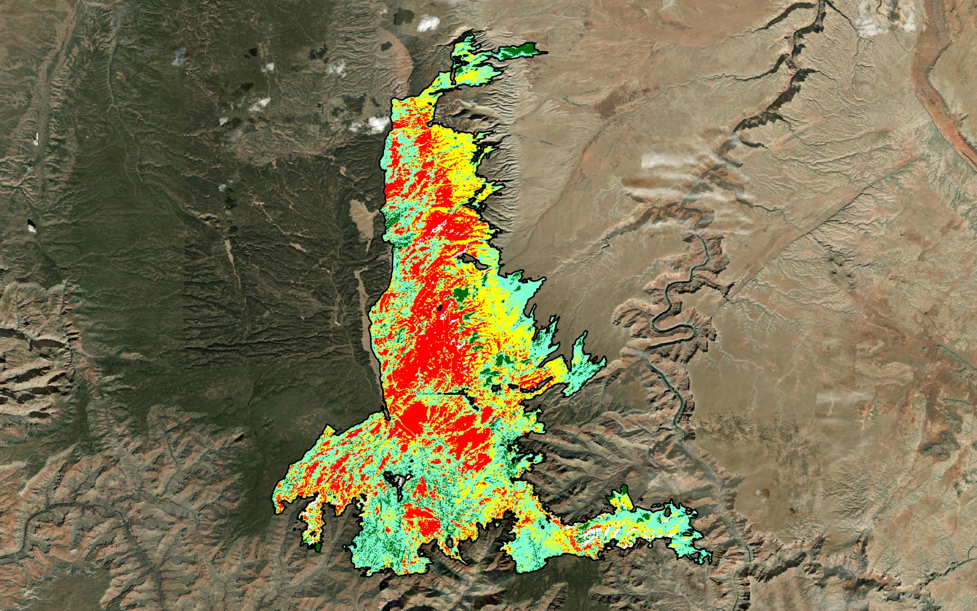
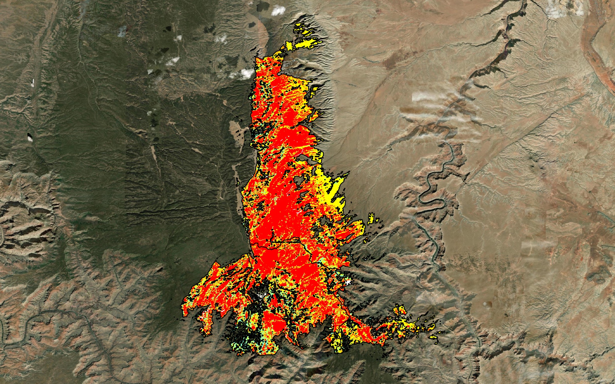
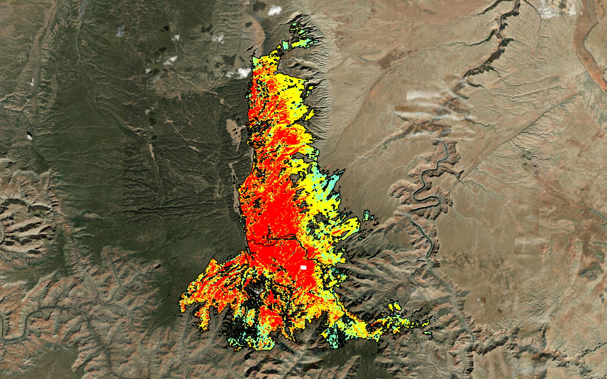
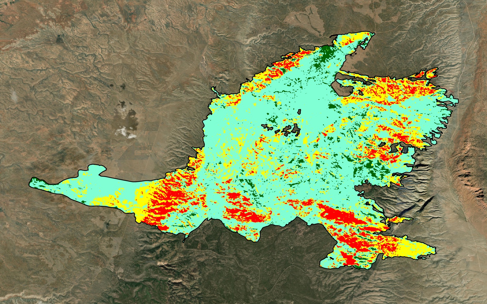
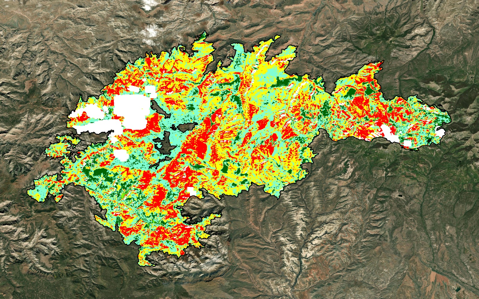
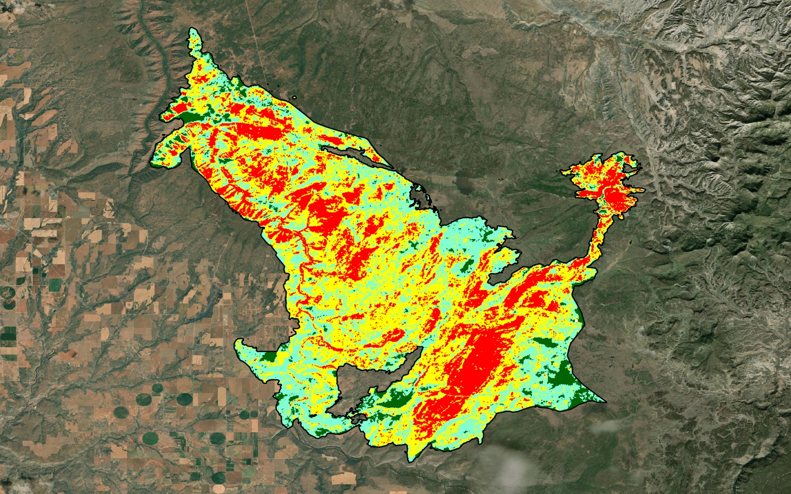
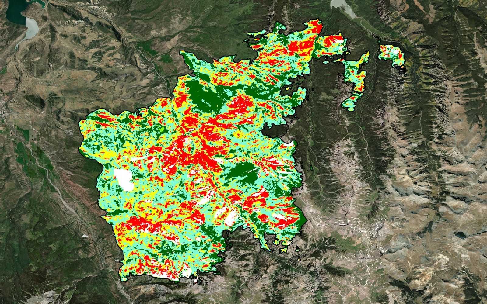
The toolkit's burn severity classes for the same area: red high, yellow moderate, aquamarine low, dark green unburned to low.
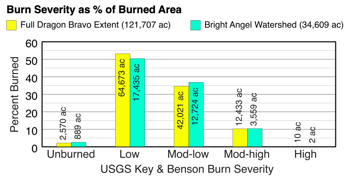
The toolkit started as a single Processing script. It was built to compare the 2025 Dragon Bravo Fire on the North Rim of Grand Canyon National Park with the Bright Angel Creek watershed inside it, and it grew into a full fire analysis pipeline modeled on the USGS/USFS MTBS QGIS Fire Mapping Tool.
The pipeline
- Imagery: suggests pre- and post-fire image pairs using MTBS rules, then fetches calibrated, cloud-masked NBR for only the area of interest. Sources are NASA HLS, Microsoft Planetary Computer (Landsat back to 1982, Sentinel-2) or locally downloaded scenes.
- Severity: builds dNBR, RdNBR and RBR, measures the unburned offset in a ring outside the fire, can draft a burned-area perimeter when none exists, and classifies into MTBS thematic classes with given or estimated thresholds.
- Summary and map: percent, hectares and acres per class for the fire and any sub-areas, an HTML report, and an A4 PDF map layout.
One dialog, Burn severity (whole pipeline), runs it all in about two minutes. It can also read fire names and dates directly from NIFC/WFIGS interagency perimeters.
Validation
Checked against the official maps. Given the same images, perimeters and thresholds as MTBS, the federal burn-severity program, the toolkit reproduces MTBS’s severity classes with substantial agreement: an average Cohen’s kappa of 0.78, where 1 is perfect and 0 is chance.
A validation harness reruns the pipeline on published MTBS fires using MTBS’s own dates, perimeters and thresholds, then compares the classes pixel by pixel. Drafted perimeters reach a mean IoU of 0.78 against MTBS perimeters.
Why it matters
The summary tool alone replaces about a dozen manual GIS steps. And because the toolkit calibrates every scene from its own metadata (Landsat scale factors, Sentinel-2 offsets), the results don’t depend on anyone remembering to apply them by hand.
Built only on QGIS’s own Processing framework, GDAL and numpy, with no extra installs. Tested on QGIS 3.44 and 4.2.
How it runs
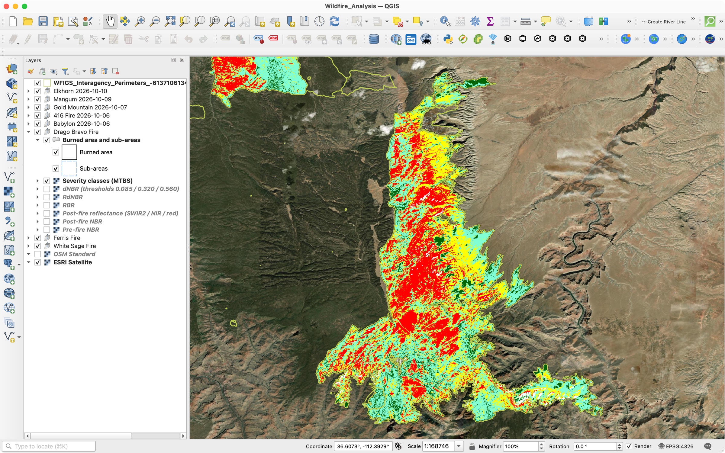
Give the pipeline a fire perimeter and dates; it picks the satellite images, builds the burn-severity layers, loads them into QGIS styled, and writes a report and a print-ready map.
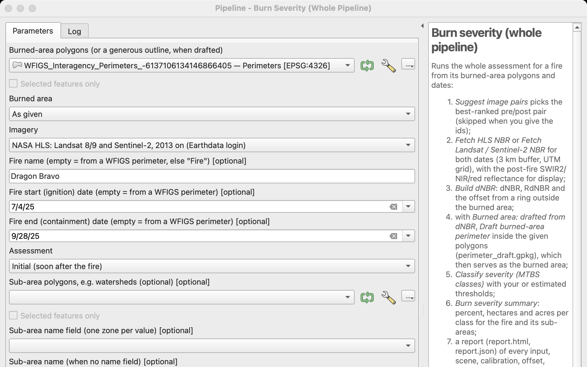
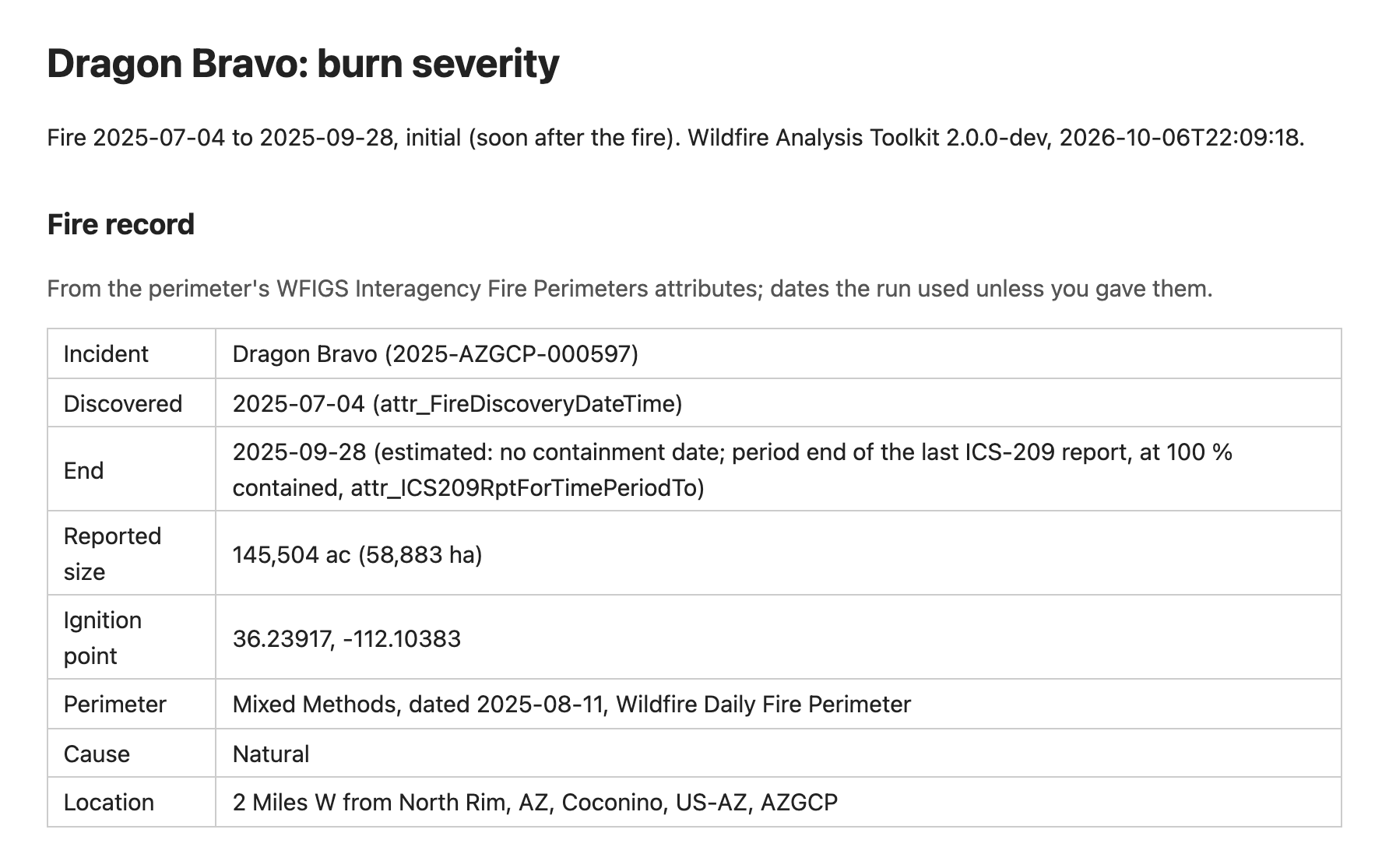
From satellite to severity
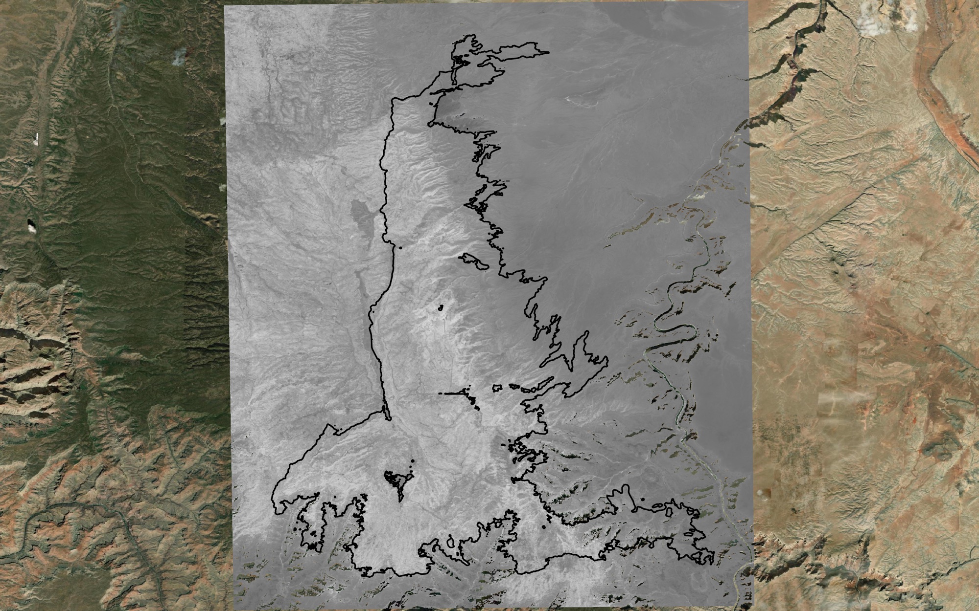
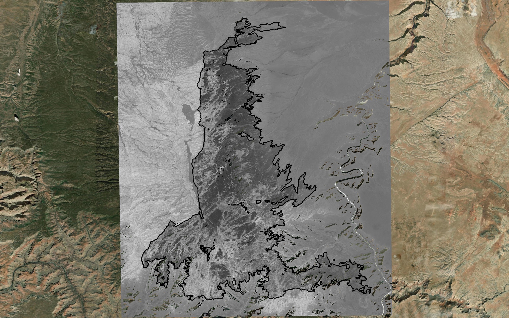
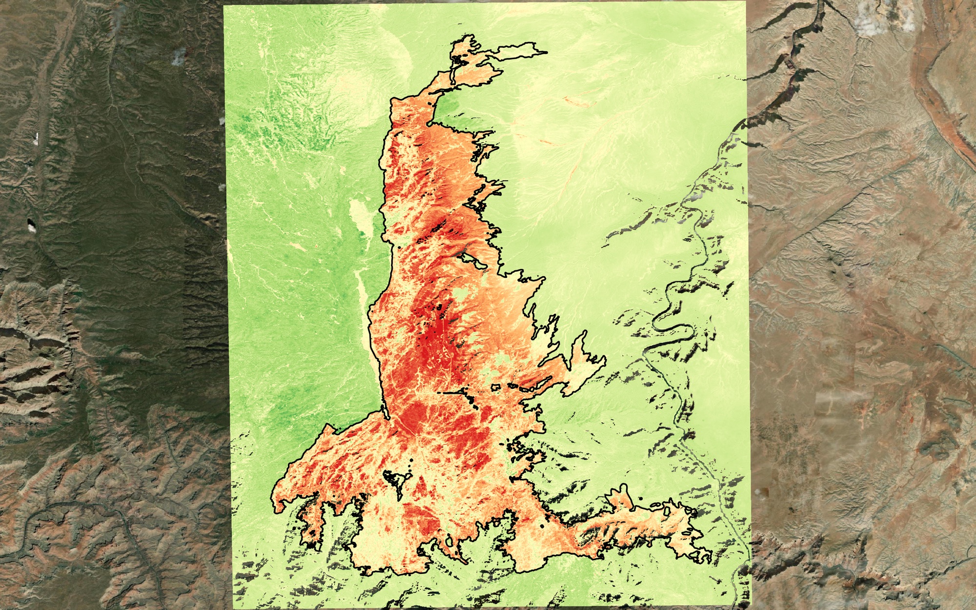
How burn severity is measured, step by step, for the Dragon Bravo Fire. The Normalized Burn Ratio (NBR) is high for healthy vegetation and drops where fire burned; the difference before and after (dNBR) shows how severely.
A growing season later
The toolkit runs two kinds of assessment, as MTBS does: one soon after the fire, and an extended one in the next growing season, when the landscape’s response is clearer.
One tool, many fires
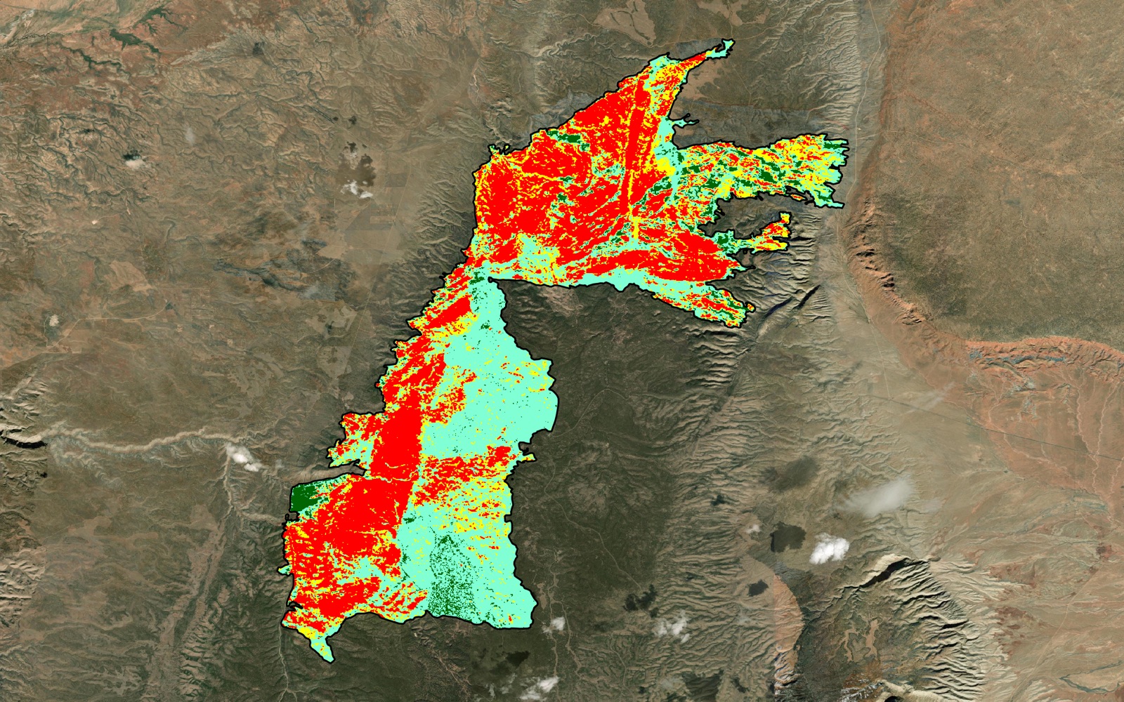
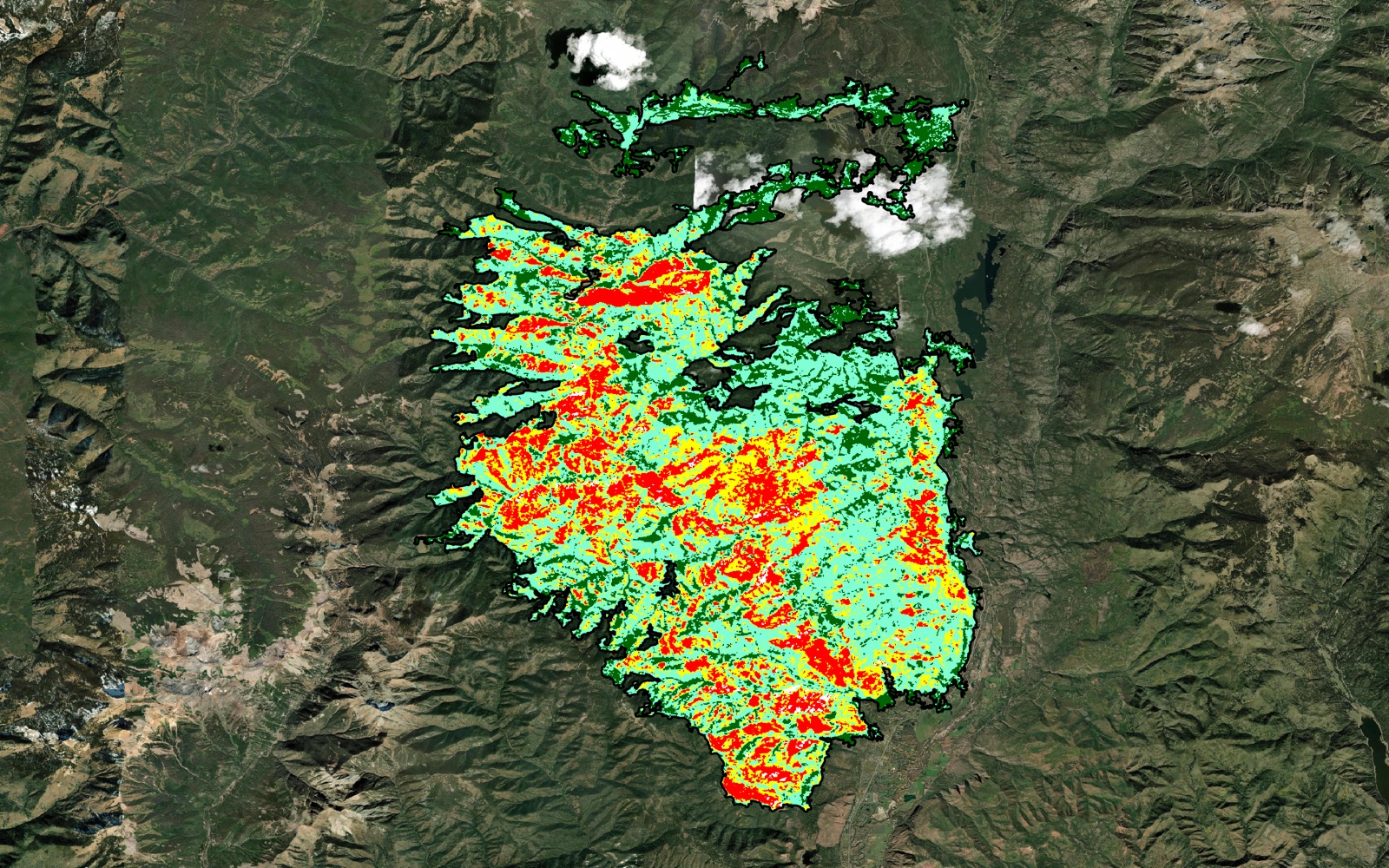
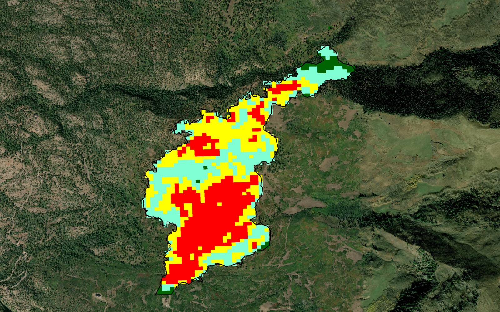
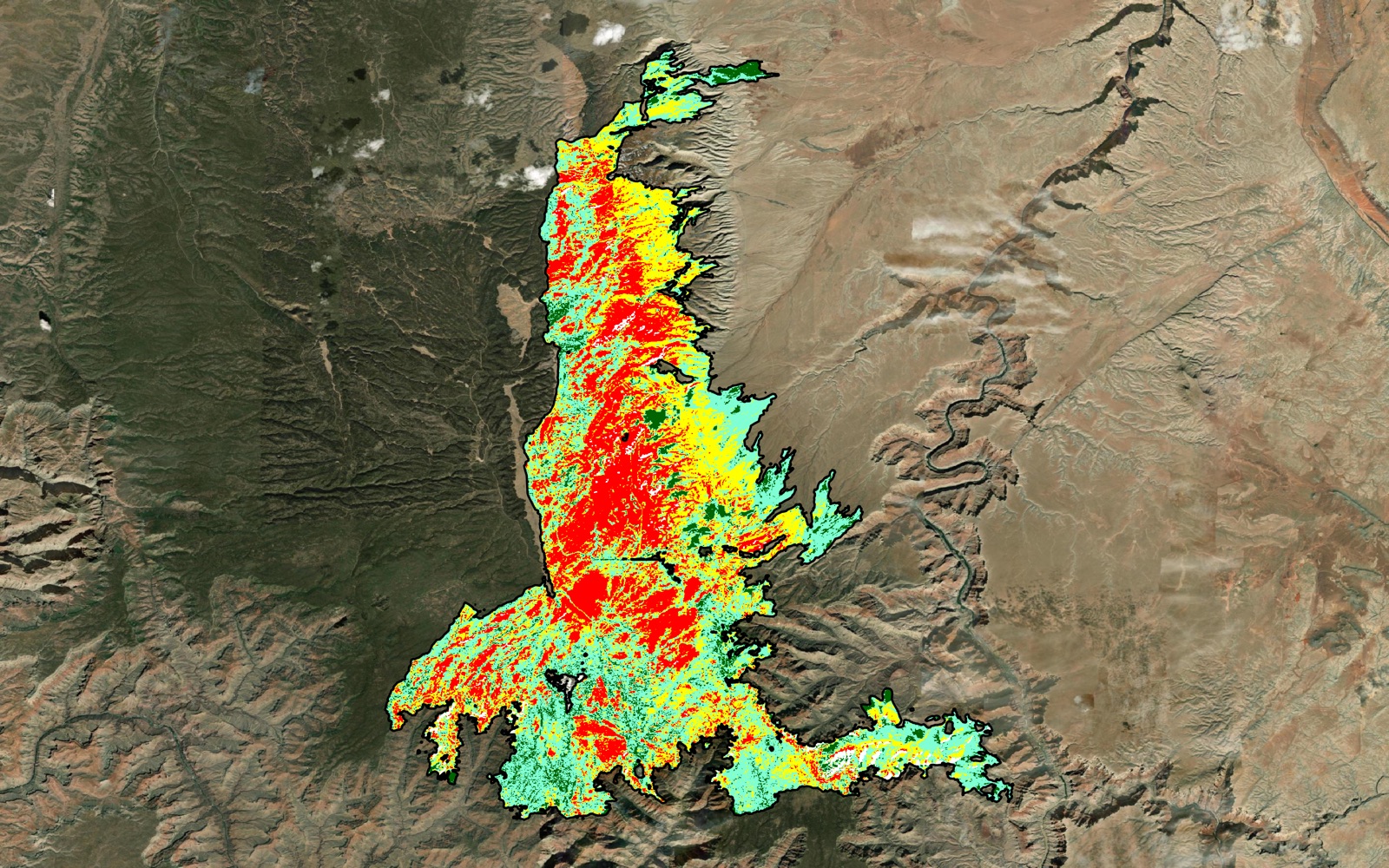
The same pipeline, run on fires across Arizona, Utah and Colorado from 2018 to 2026. Each map shows the MTBS severity classes inside the burned area.
Maps